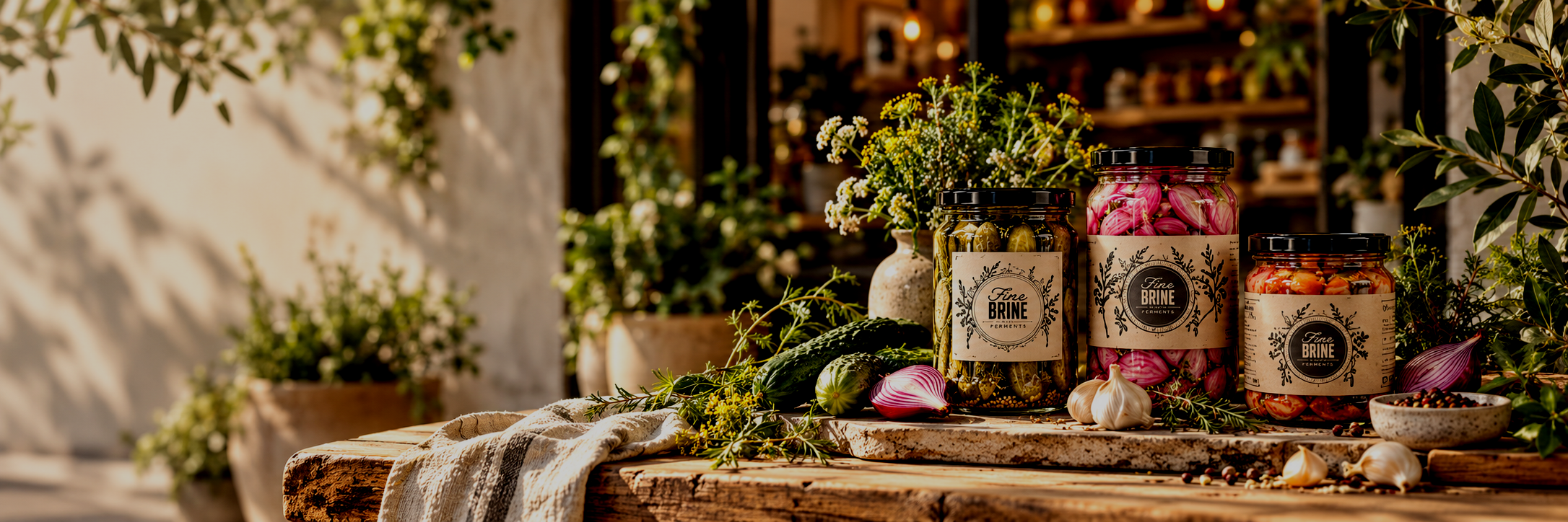
Fine Brine Brand Ecosystem
From sketch to complete brand ecosystem
What began as a request for a modern, rustic identity gradually expanded into a much larger vision for the brand. Starting with hand-drawn logo concepts, I developed a refined identity system and then explored how that visual language could extend into a physical storefront, product packaging, editorial design, and a responsive digital experience.
My role grew naturally with the project. As the brand became more defined, I created 3D architectural visualizations to help imagine what a future Fine Brine location could look like, then carried the same visual direction into a website concept and a fully designed cookbook.
Role:
Brand identity, art direction, graphic design, 3D visualization, editorial design, web design
Tools:
Photoshop, Illustrator, InDesign, 3D modeling/rendering in Maya, web design tools
Fine Brine began as a relatively simple branding project. A logo.
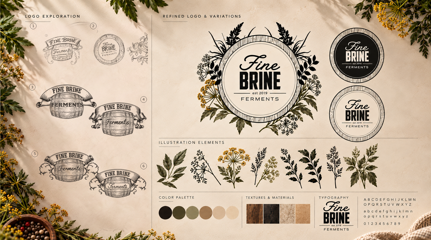
Building the Identity
The client wanted a modern, polished identity rooted in the handmade craft of fermentation. I explored hand-drawn concepts before refining a circular logo that paired bold typography with botanical and wood-inspired illustration.
Alternate logo treatments, natural colors, and supporting motifs created a flexible foundation that grew into packaging, a storefront concept, a website, and a cookbook.
Imagining the Brand in the Real World
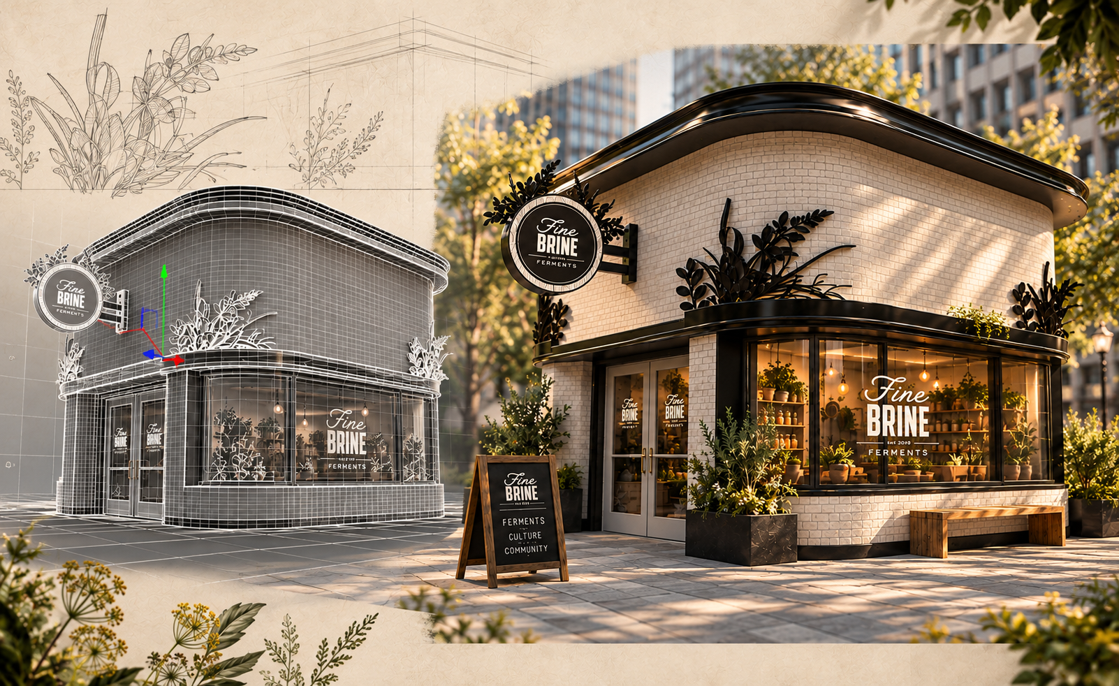
As the client began imagining Fine Brine as a physical business, I created a 3D storefront concept to bring the brand into a real-world environment. Architecture, signage, materials, lighting, and interior direction were all designed around the existing identity, helping turn the brand from a graphic concept into a tangible experience.
Extending the Brand Across Product and Editorial
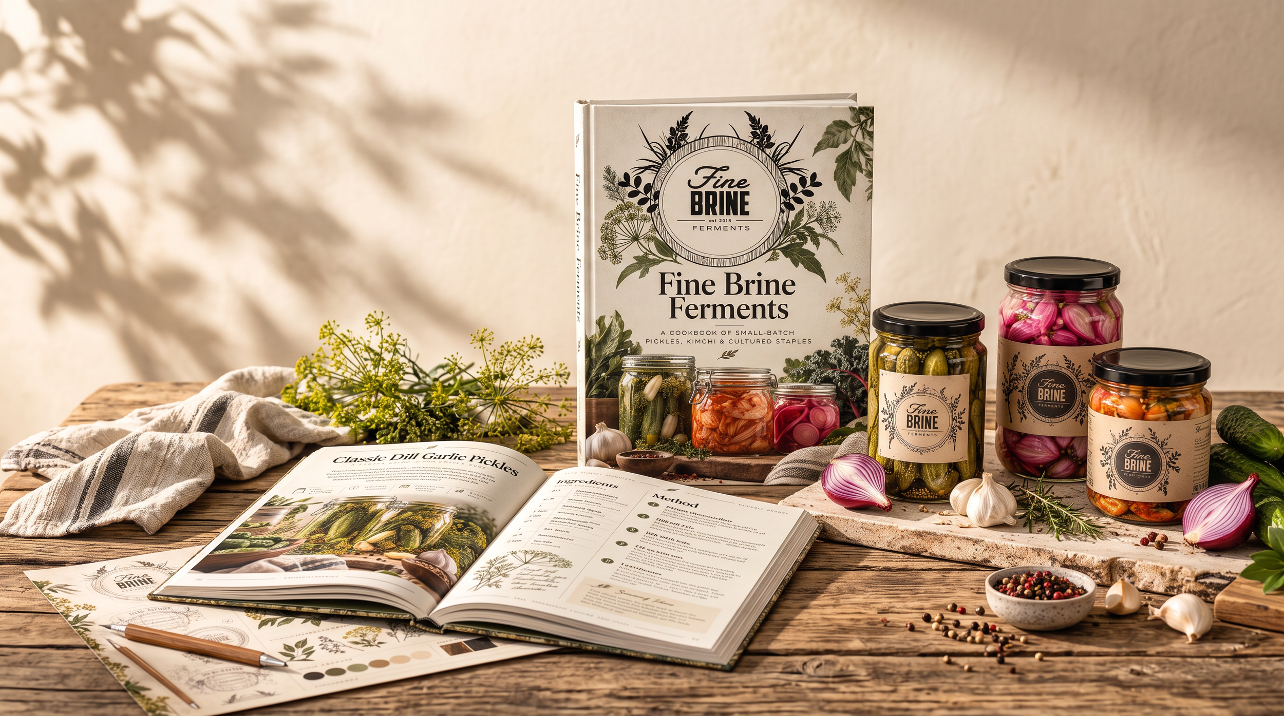
Once the visual world was established, I extended it into packaging and editorial design. I developed product labels and a cookbook concept using the same typography, illustration, materials, and imagery, creating a cohesive brand system across every touchpoint.
Designing the Digital Experience
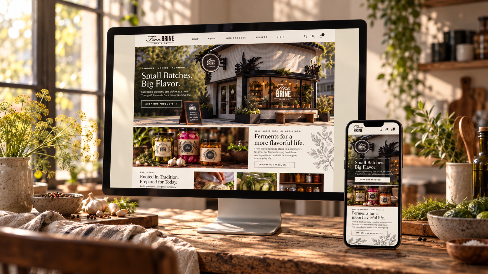
I then translated the Fine Brine world into a responsive website concept.
The site was designed to feel consistent with the physical and editorial brand experience, with warm photography, natural textures, botanical illustration, and a simple hierarchy that kept the experience approachable and easy to navigate.
Desktop and mobile layouts were developed to show how the brand could scale across devices without losing its personality.
Outcome
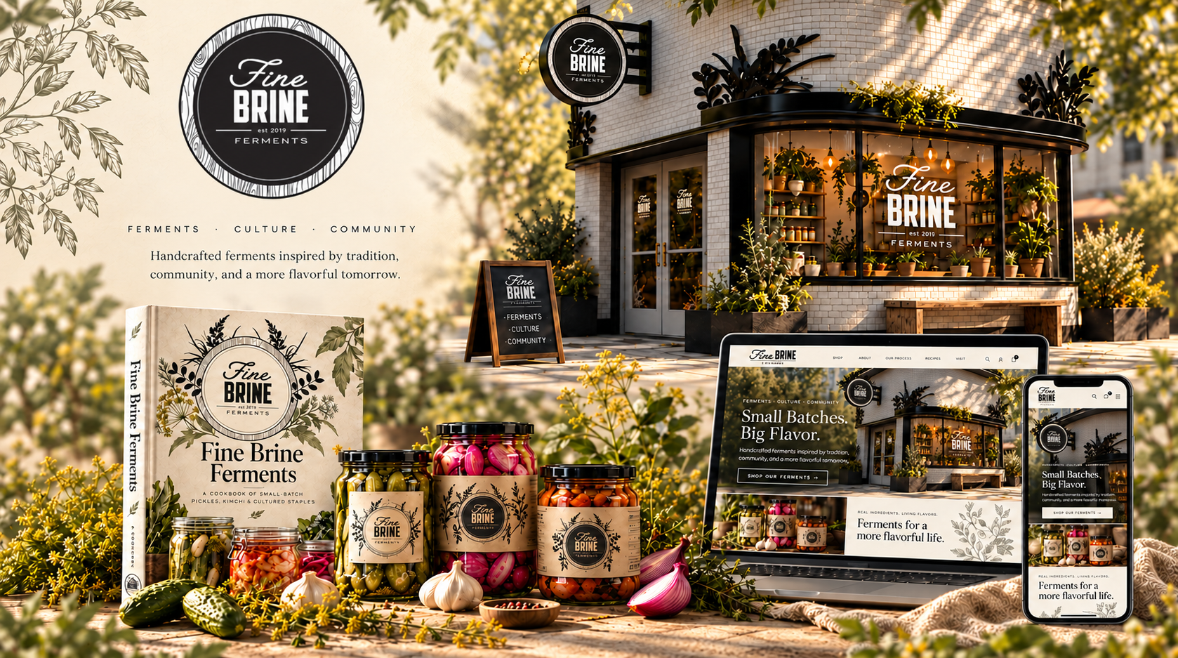
Fine Brine evolved from a handful of early logo sketches into a fully realized brand concept spanning identity, packaging, environmental design, editorial, and digital experience.
The most satisfying part of the project was being able to carry one visual idea through every stage and imagine how the brand could exist as a complete business, not just as a logo.